The Traffic Report gives you a complete view of how visitors reach your website. It helps you understand which sources bring the most traffic, which channels convert better, and where your most valuable visitors come from.
To access this report, click on your Analytics top tab, open Analytics Dashboard, and select Traffic.
Traffic overview
At the top of the report, you’ll see the main traffic indicators for the selected period:
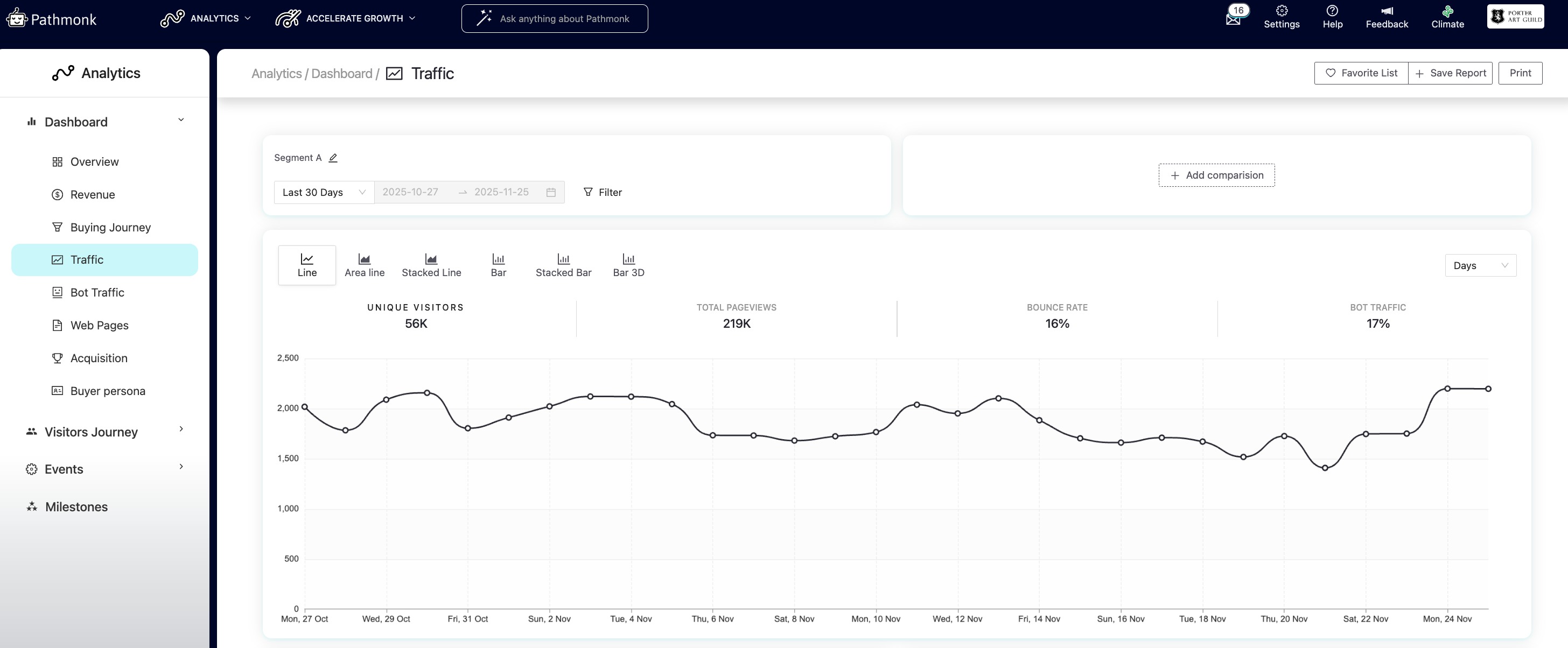
- Unique visitors: This number represents the total count of individual users who visited your site, identified through their visitor fingerprint. Even if someone visits multiple times, they are only counted once.
- Pageviews: This shows the total number of pages viewed, regardless of how many times the same visitor navigates through the site.
- Bounce rate: The percentage of users who leave the site after viewing just one page. A high bounce rate may suggest that the landing page needs improvements or that visitors aren’t finding what they expected.
- Bot percentage: This metric highlights what portion of your traffic comes from bots.
For example, if 8% of your traffic is automated or non-human, this helps you evaluate the true impact of your real audience.
This section gives you a quick snapshot of overall performance and helps you spot anomalies or traffic spikes. You can visualize this using Line, Area line, Stacked line, Bar, Stacked bar, or 3D bar charts.
⚠️ If your traffic report doesn't match what you're seeing on your Google Analytics, don't worry. We use different technologies to track visitors (Pathmonk's cookieless, tracks visitors across devices, has a lower bot traffic threshold, etc). To understand where that difference is coming from, read this article.
Applying dates, filters, and comparing segments
At the top of the Traffic Report, you can select the time period you want to analyze. You can choose from preset ranges (Last 7 Days, Last 30 Days, etc.) or set a Custom date range.
You can also apply filters to narrow the traffic you’re analyzing. The filter panel lets you refine by traffic type, referral, UTM source, UTM medium, UTM campaign, and device. Once you select your criteria, click Apply filter. To return to the default view, use Delete filters.
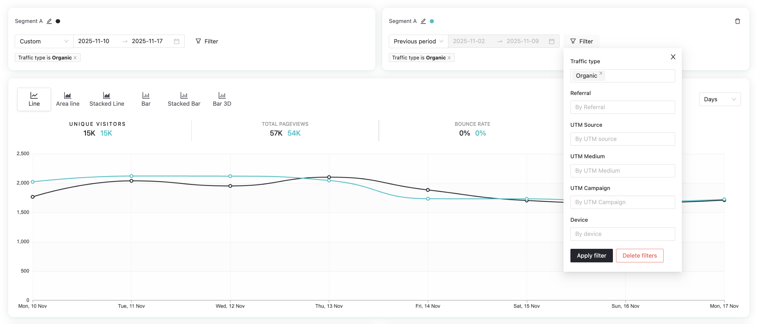
The report also supports comparing two segments side by side, as in the example above. When you enable a comparison, Pathmonk displays a second segment with its own date range and filters. This allows you to compare traffic types (for example, Organic vs Paid), different weeks, or two audiences. The chart will display both lines so you can easily see shifts in traffic volume, pageviews, and bounce rates across the two segments.
Top referrals
Here you can explore the websites that brought the most traffic to your site. For each referral, you’ll see:
Visitors
Pageviews
Bounce rate
Conversions
Quality score
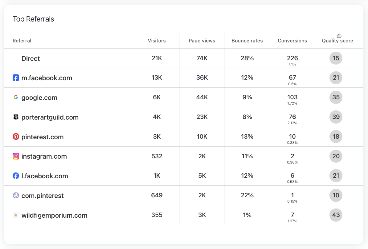
Use this section to identify which external domains bring the most engaged visitors and which sources may need attention. For example, you might notice that exampleblog.com sends fewer visitors but has an outstanding conversion rate, meaning it could be a high-value partnership opportunity.
Top UTMs
UTMs (Urchin Tracking Modules) are codes added to URLs to track campaign performance, helping you evaluate the performance of paid campaigns, newsletters, social posts, and any external links where UTM parameters were added. In this section, you can quickly understand which campaigns are making the biggest impact.
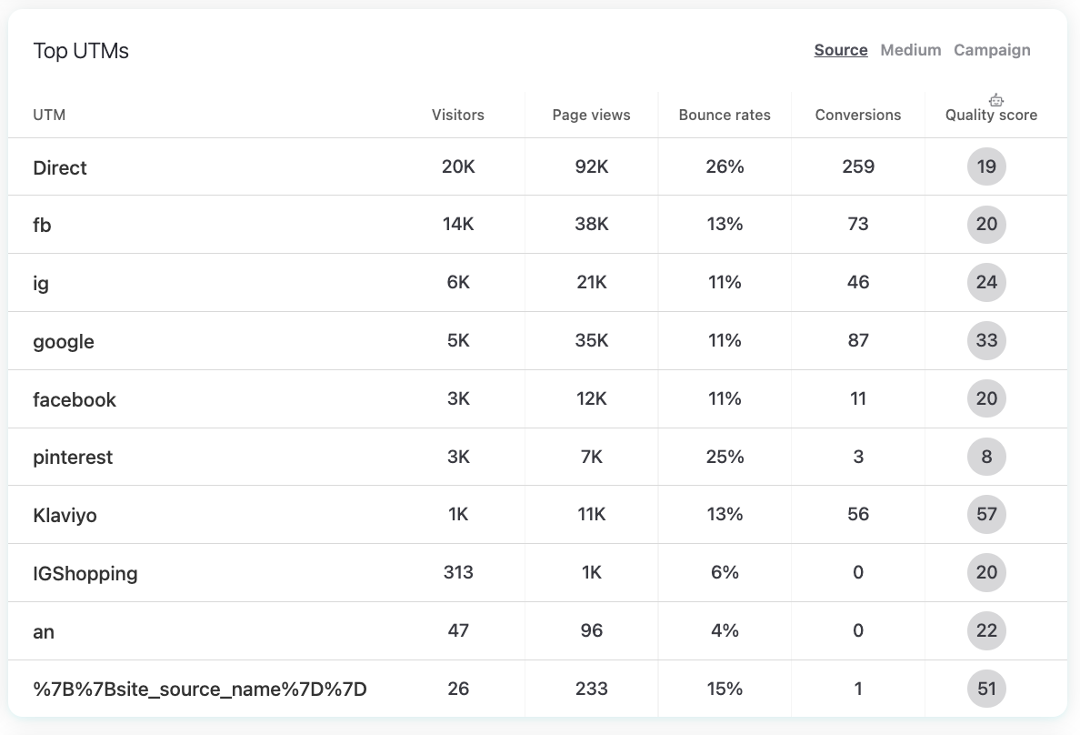
This is incredibly useful if you are comparing, for example, utm_campaign=spring_sale vs. utm_campaign=brand_awareness. Even if both drive similar traffic, the Quality Score or conversion rate may reveal which campaign is worth scaling.
Top channels
The Top Channels table groups traffic into standard marketing channels such as Direct, Social, Paid, Organic, Referral, and Email.
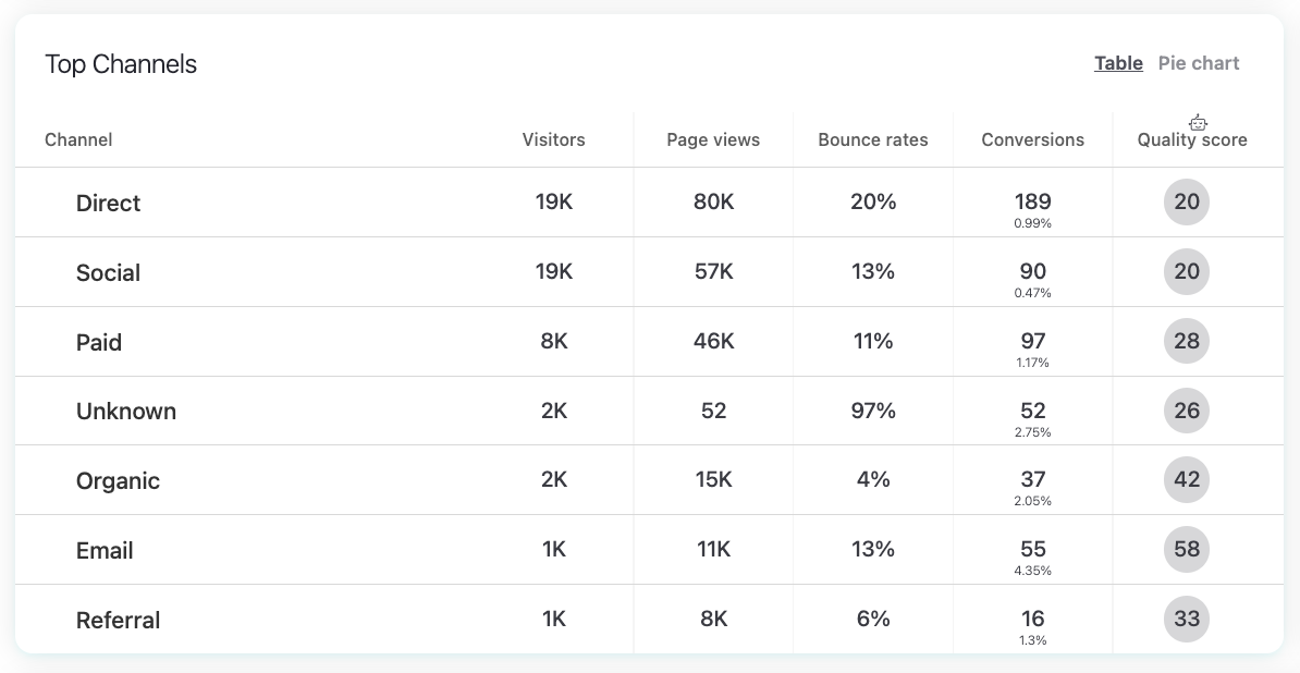
For each channel, you can track:
Visitors
Pageviews
Bounce rate
Conversions
Quality score
This section shows which channels bring the most engaged users and which ones contribute most to conversions. You can switch between a Table view and a Pie chart.
Locations
The Locations section shows where your visitors come from geographically. You can view the data in two ways:
Map – a heatmap showing visitor density by country.
Countries – a list of countries and the number of visitors from each one.
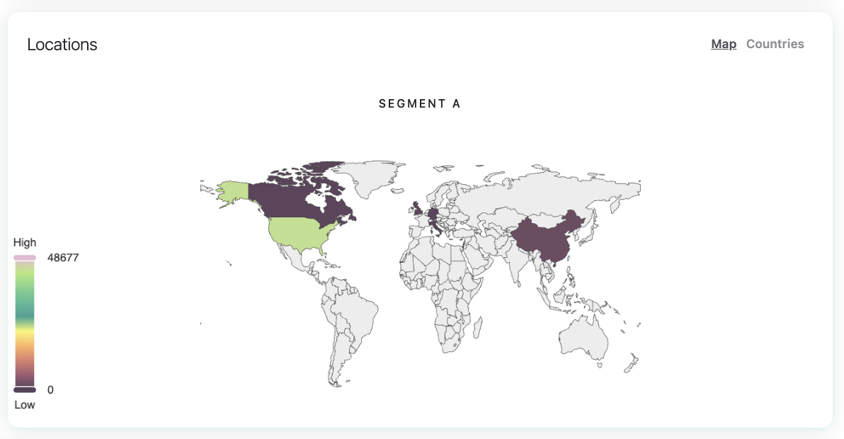
This helps you understand your strongest markets and identify new regions driving traffic.
Analyzing your top pages
At the bottom of the report, you’ll find the pages on your site that attract the most user activity. You can also sort the list by:
Top visits
Top entries (pages where people arrived first)
Top exits (pages where people tend to leave)
Top conversions
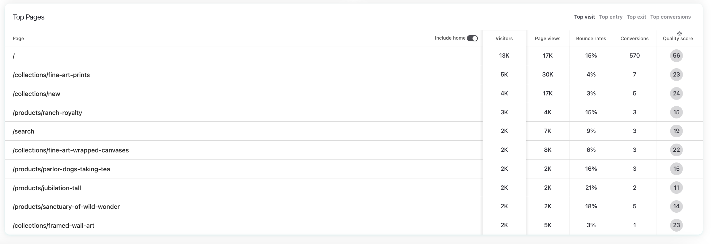
Since the homepage often dominates traffic metrics, there is also an “Include Home” toggle.
By disabling it, you can focus on the performance of other pages, this proves extremely useful when analyzing product pages, landing pages, blog articles, or pricing pages.
How to use this report
Use the Traffic report to:
Identify which sources and channels drive the most engaged visitors.
Spot sudden increases or drops in traffic.
Validate the performance of UTMs and paid campaigns.
Compare traffic quality across different channels or referrers.
Understand where your audience comes from geographically.
Find your highest-performing pages to guide content and UX decisions.
Was this article helpful?
That’s Great!
Thank you for your feedback
Sorry! We couldn't be helpful
Thank you for your feedback
Feedback sent
We appreciate your effort and will try to fix the article