Pathmonk gives you several ways to apply your branding so microexperiences look consistent with your website. You can style everything during onboarding or adjust it later from your dashboard. Below is an overview of all customization options and how they work.
1. Branding during onboarding (recommended before publishing)
In the final onboarding step, Pathmonk prompts you to set a few core branding elements. These don’t take long, and they help ensure that your first version looks aligned with your brand.
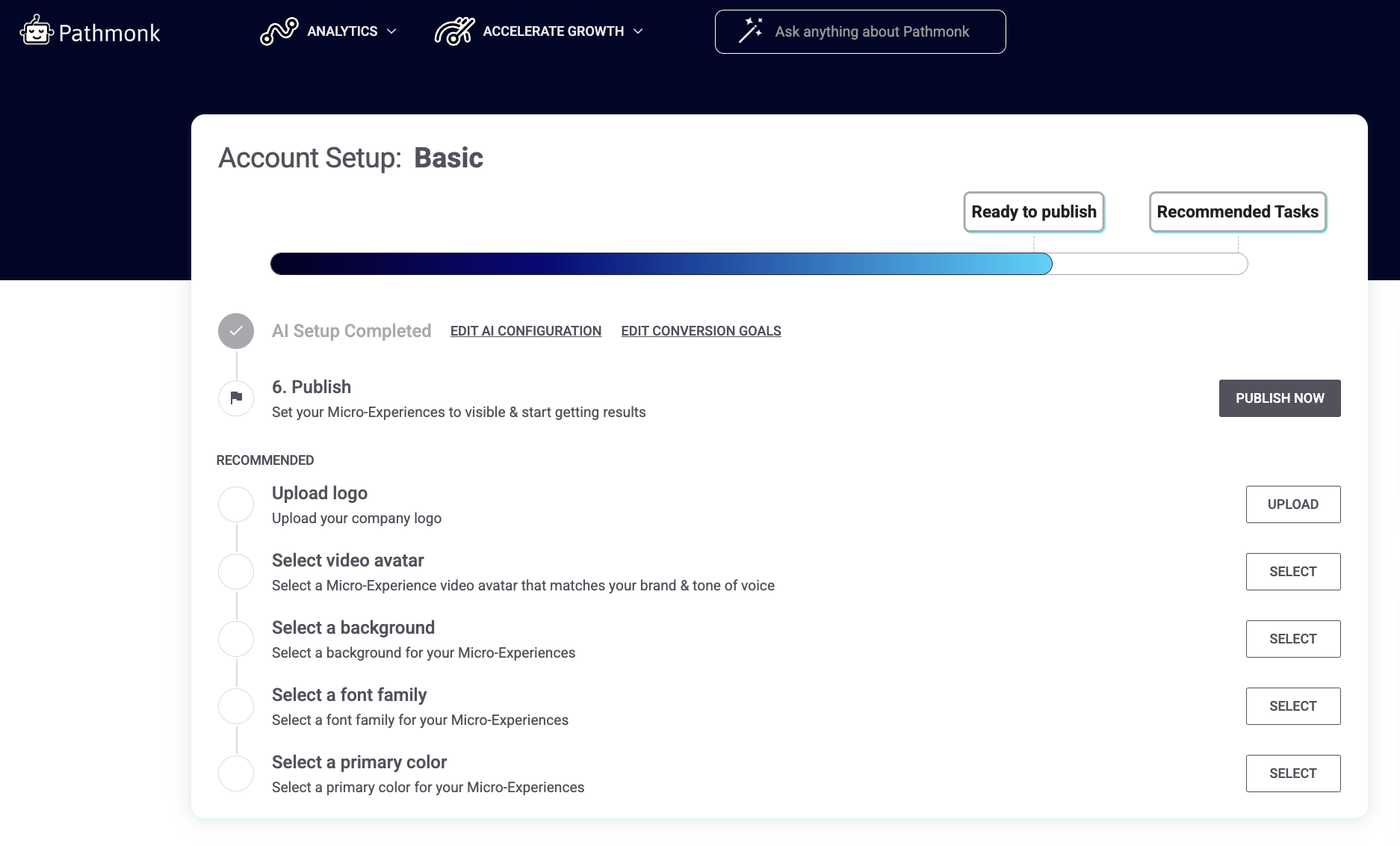
You can update:
Logo – appears on your Micro-Experiences to add familiarity and trust
Video avatar – choose a starter avatar; you can replace it with your own video later
Background – solid color or an uploaded image
Font family – pick a font that matches or complements your website
Primary color – used for buttons and key UI elements
None of these steps are mandatory to publish, but completing them upfront avoids the feeling of a “generic” starting point once you're live. If you're unsure about fonts or colors, start with the basics during onboarding. You can refine everything after publishing.
2. Update your branding anytime under Micro-Experiences > Design
Once your account is live, all appearance settings can be updated at any time from: Accelerate Growth > Micro-Experiences > Design. This is where you can adjust the visual details as many times as you need.
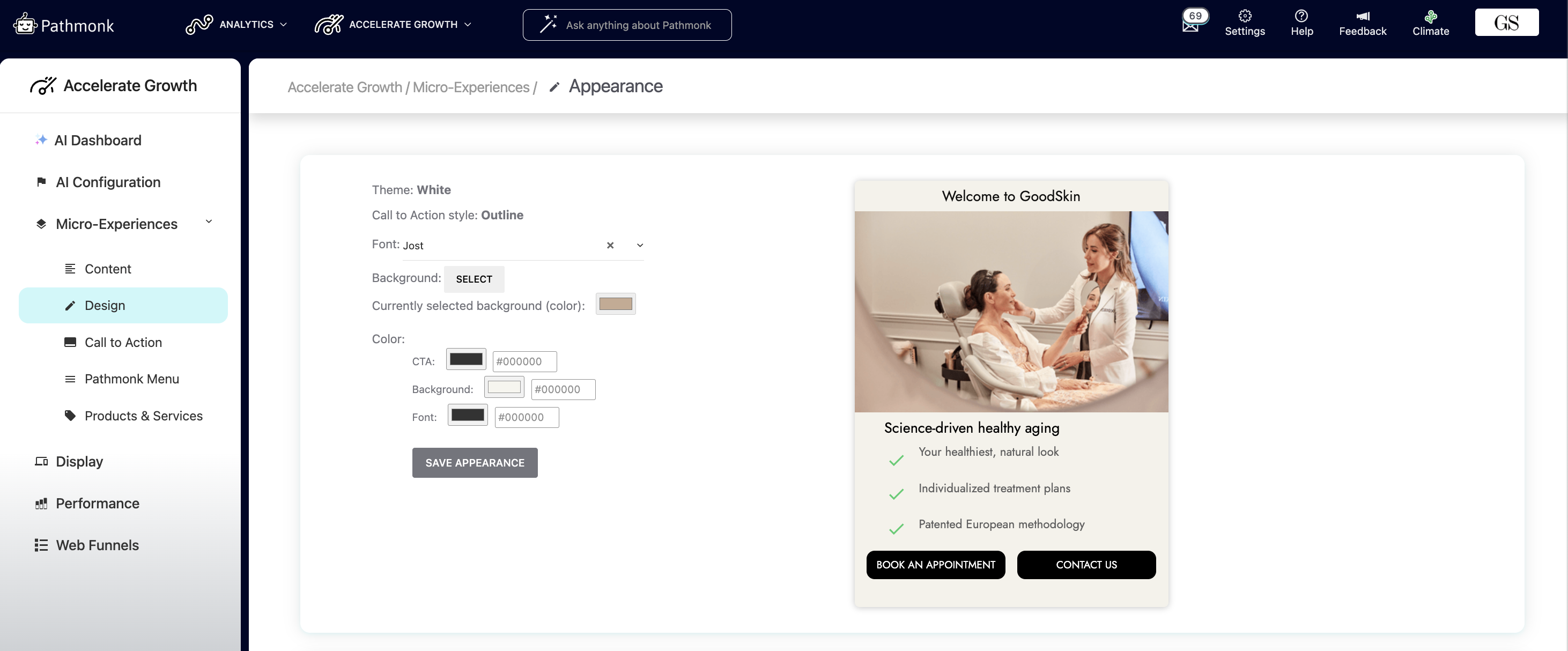
You’ll find options to:
Change your font
Update your background (color or upload a new image)
Modify CTA color, text, and background colors
Preview how the card will look before saving
3. Advanced styling with CSS (optional but powerful)
For teams with strict brand guidelines or very specific requirements, Pathmonk supports custom CSS. This allows full control over the look and layout of the cards. You can access this feature via Accelerate Growth > Micro-Experiences > Design > scroll down to 'Advanced Style Customization'.
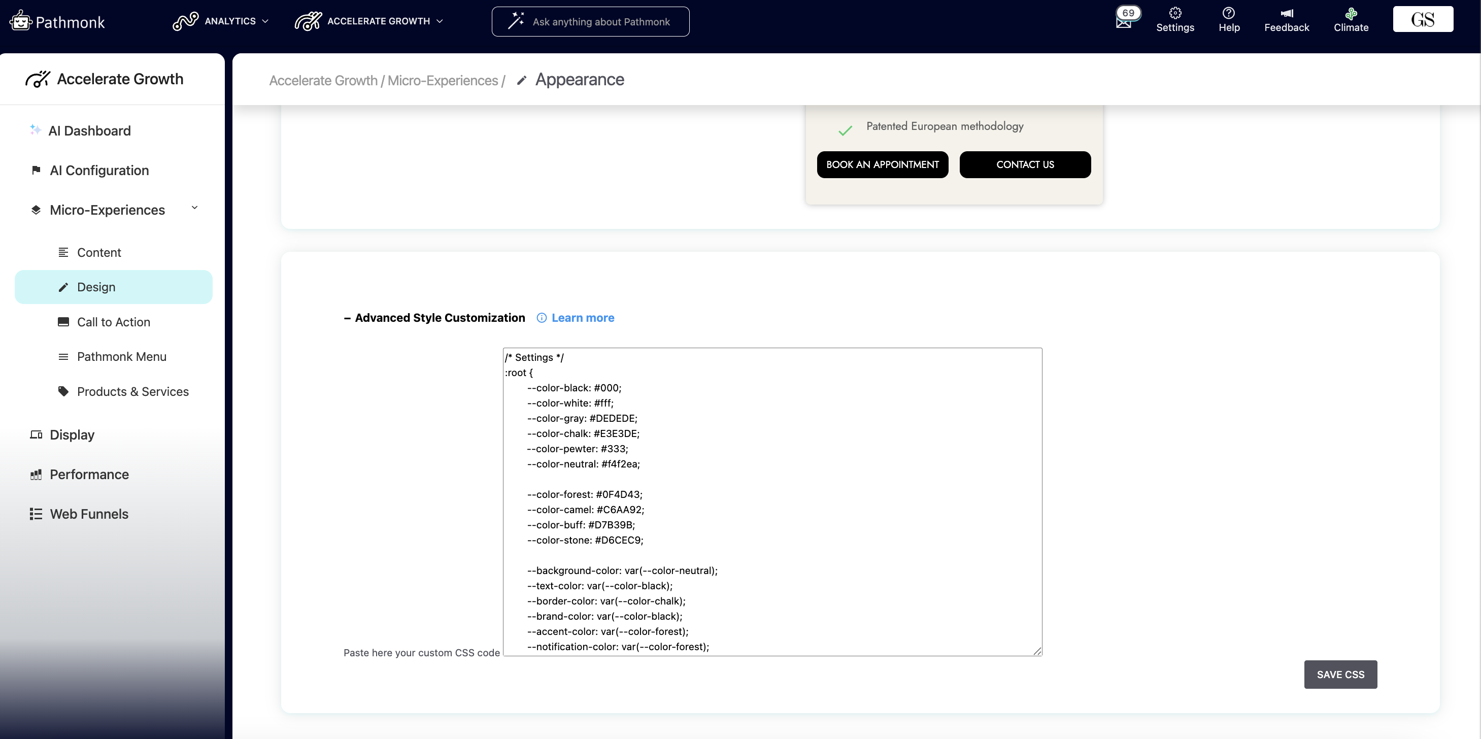
You can use custom CSS to:
Adjust spacing (padding, margins, card height/width)
Override default typography
Add subtle hover effects
Modify borders, shadows, or other UI details
Hide certain elements if they aren’t relevant for your design
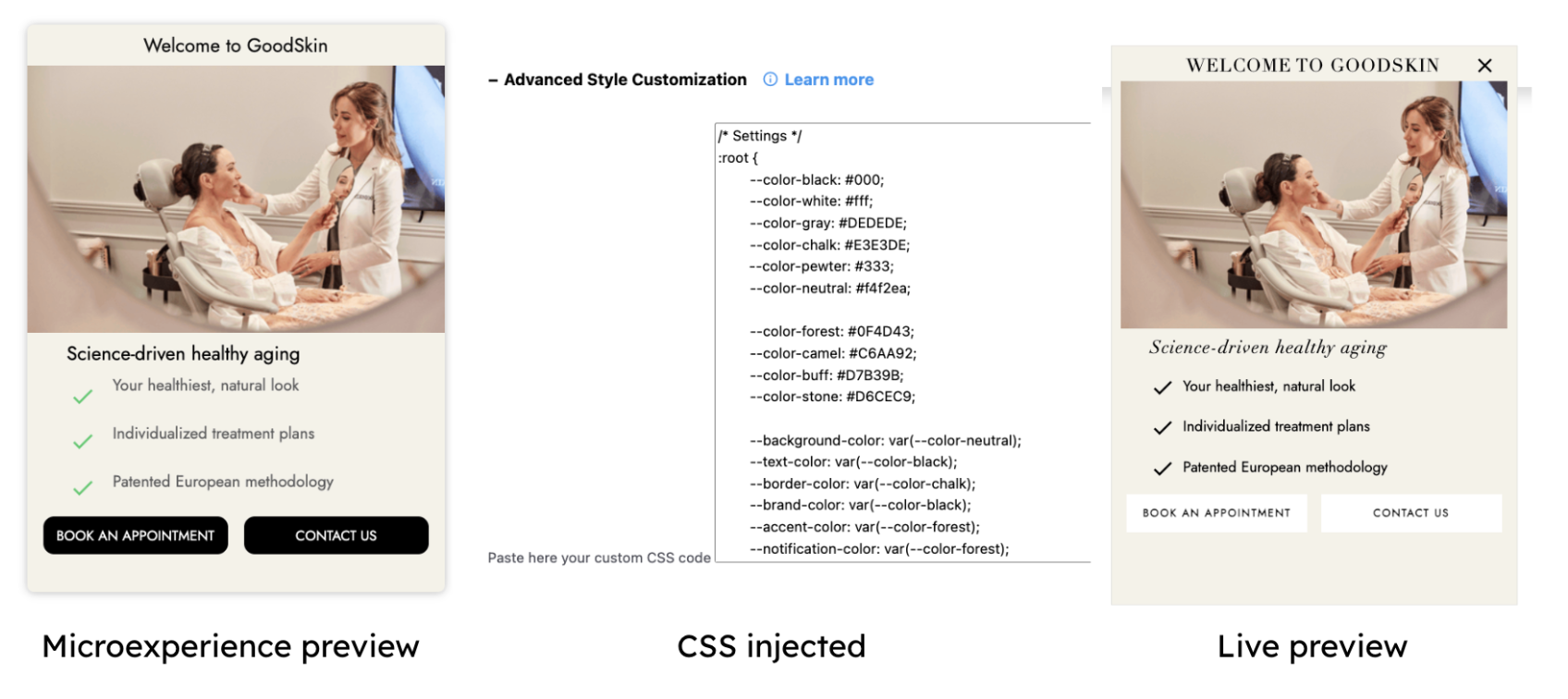
Below is an example from one of our customers with CSS overwriting our system defaults:
This is ideal if:
You follow a detailed design system
You need visual consistency across multiple languages or markets
Your brand uses spacing, alignment, or visual patterns that aren’t available in the default UI
Adding the following styles will make the element look & feel like your exact website style.
| CSS Styling Guide | |||
| Element | Class/ID | Class/ID Name | Example |
| Button | Class | .btn | .btn { border-radius: 10px !important; font-weight: 400; height: 40px !important; text-transform: none; font-weight: 600; font-size: 15px; box-shadow: none !important; } |
| Button Hover | Class | .btn:hover | .btn:hover { background-color: #5F9EA0 !important; border-color: #5F9EA0 !important; } |
| Micro-Experience Headline Fonts | ID | #spotMessageWidget | #spotMessageWidget{ color: #1A1D20 !important; font-weight: 600; font-size: 20px; font-weight: 600; font-family: "Roboto"; font-weight: 700 !important; line-height: 1.2 !important; font-size: 20px !important; } |
| Micro-Experience Body Fonts | HTML | html | html{ font-weight: 400 !important; font-style: normal !important; font-stretch: normal !important; line-height: normal !important; letter-spacing: normal!important; font-size: 16px !important; } |
| Icon Color | ID | #cardFramePathmonk | #cardFramePathmonk i.material-icons { color: #626262 !important; } |
| Minimize Icon Color | ID | #minimizerWidget | #minimizerWidget{ color:#25EEFD !important; } |
| Micro-Experience Shape Top | ID | #textBoxFramePathmonkTabStyle | #textBoxFramePathmonkTabStyle { border-top-left-radius: 10px !important; border-top-right-radius: 10px !important; } |
| Micro-Experience Shape Bottom | Class | .bottomBorderCard | .bottomBorderCard { border-bottom-left-radius: 10px !important; border-bottom-right-radius: 10px !important; } |
Use the !important tag to ensure to apply your required changes.
To see the final version exactly as it will appear to visitors:
Go to the preview page:
https://crm.pathmonk.com/dashboard/assistant/smartcards_previewSelect the microexperience you want to test.
Click See live to display the full, styled version.
This preview simulates the real visitor experience, including any custom CSS applied.
Not seeing a new image or video?
If your updates don't appear when previewing, it’s most likely due to browser caching. Browsers sometimes store older assets, which prevents new uploads from showing immediately.
Fix: Clear your browser’s cache. Once it's cleared, refresh the preview and your changes should display correctly.
If you still need help with your microexperiences, get in touch with our team at support@pathmonk.com and we'll get you ready for success.
Was this article helpful?
That’s Great!
Thank you for your feedback
Sorry! We couldn't be helpful
Thank you for your feedback
Feedback sent
We appreciate your effort and will try to fix the article